Interior Color Psychology

Introduction


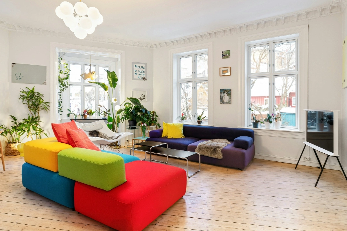
The Psychology Behind Interior Color palettes-. Ever have that feeling when you walk into a room and suddenly feel calmer, energized, or maybe just- like- wrong without knowing why? Well, the answer can be found when exploring color psychology in interiors.

Beyond purely aesthetic choices, color has a profound ability to evoke a wide range of feelings and moods- positively affecting the atmosphere, level of alertness and emotions.

No matter the room – cozy haven to the sleek bachelor pad- the colors selected for your spaces play a fundamental role in how people will feel living in them.

Let’s dive into the psychology behind some of my favorites:

What is Interior Color Psychology?

What is interior color psychology concept in interior design
What is Interior Color Psychology? Meaning, Benefits, and Design Tips

The psychology of color within interiors refers to the way in which a particular color combination might bring about an emotional or physiological response in people occupying a space. Designers deliberately implement specific color psychology in order to assist a particular area to feel either peaceful, energetic, welcoming, elegant, or conducive to concentration. Certain criteria that assist with the psychology of colors in design:

Better comfort can be achieved.
Instill a sense of tranquility or promote focus.
Space can appear to be lighter or cozier. Establish visual equilibrium. Personal preferences can be expressed. Appropriate colors can be chose to be associated with a specific room’s function.

The psychology of color, however, is not rigid. Our perceptions of a color are just one facet among many other things like one’s own experiences (world events), culture, general preferences and personal likes, the lighting, etc.

Why Color Psychology Matters in Interior Design
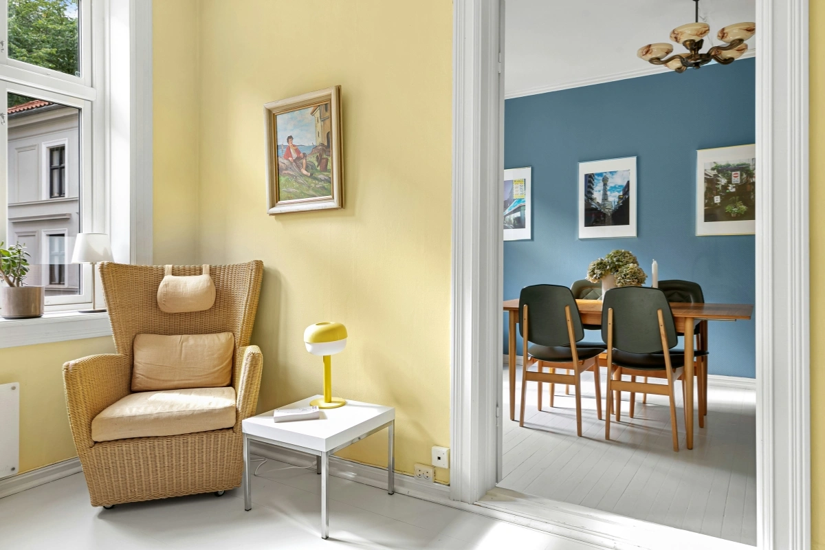
Why color psychology matters in interior design concept
Why Color Psychology Matters in Interior Design:  Colors, Mood, and Space

Color psychology also extends to interior design. This has the ability to shape how humans feel and behave. Here are some examples:
Bright colors and increased energy levels

Soft colors and stress reduction

Dark colors can create a sense of depth, sophistication, or visual weight.
In studies discussed by the American Psychological Association, stimuli from color can play an immense role in perception and intellect.

How Colors Affect Mood in Interior Spaces

Different colors can create different impressions depending on their shade, saturation, surrounding colors, and lighting. Therefore, it’s usually better to think about the overall color combination rather than relying on one color alone.

Blue Color Psychology in Interior Design
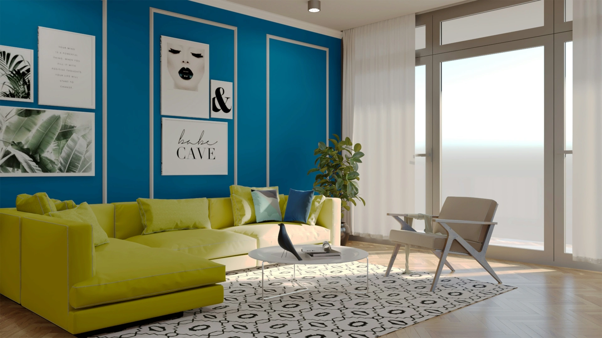
Blue color psychology in interior design modern living room
Blue Color Psychology in Interior Design: تأثير Blue Color Psychology in Interior Design

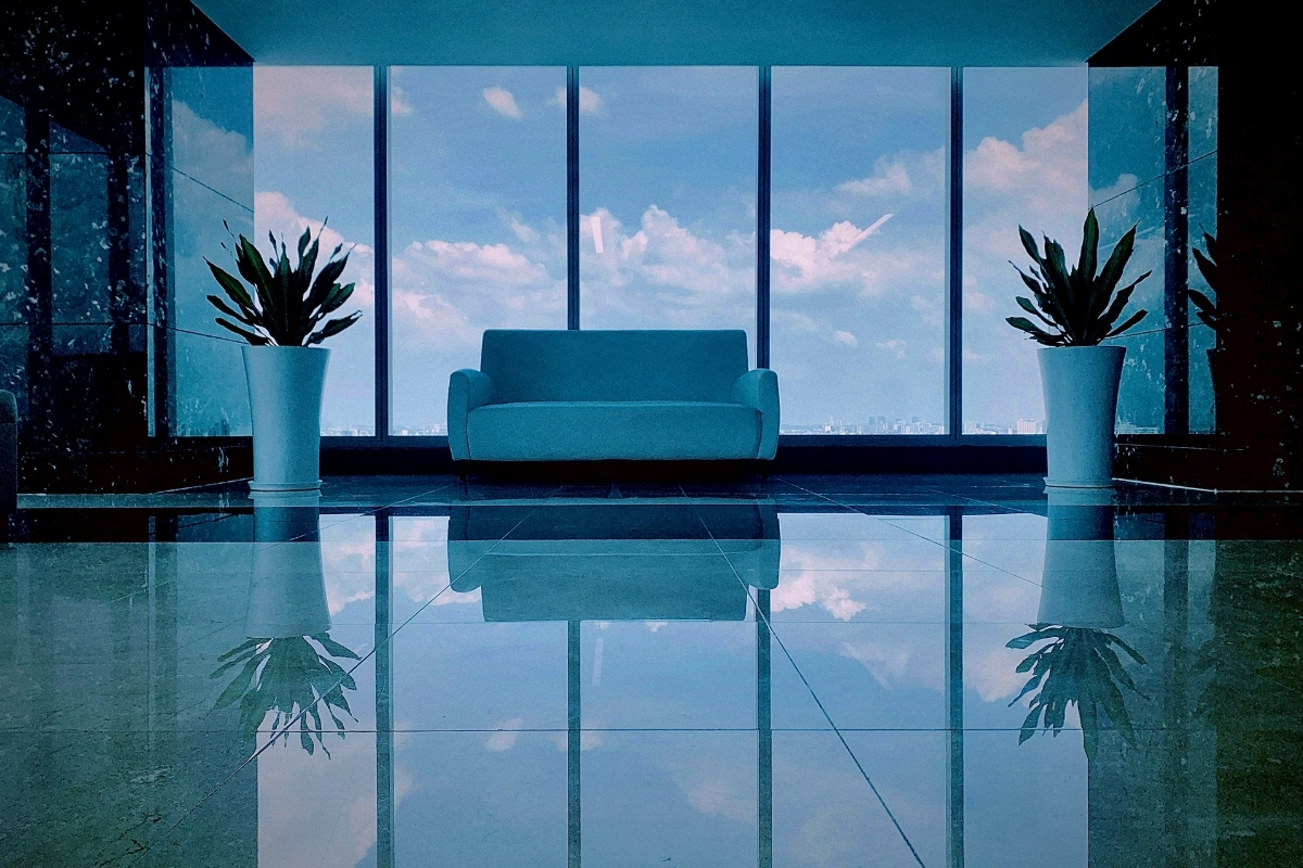
Blue is one of the most popular colors in interior design—and for good reason.

Effects of blue:

  • Promotes calmness and relaxation
  • Reduces stress and anxiety
  • Improves focus and concentration

Best for:

  • Bedrooms
  • Offices
  • Study areas

Light blue creates a peaceful atmosphere, while dark blue adds depth and sophistication.

Benefits of blue:

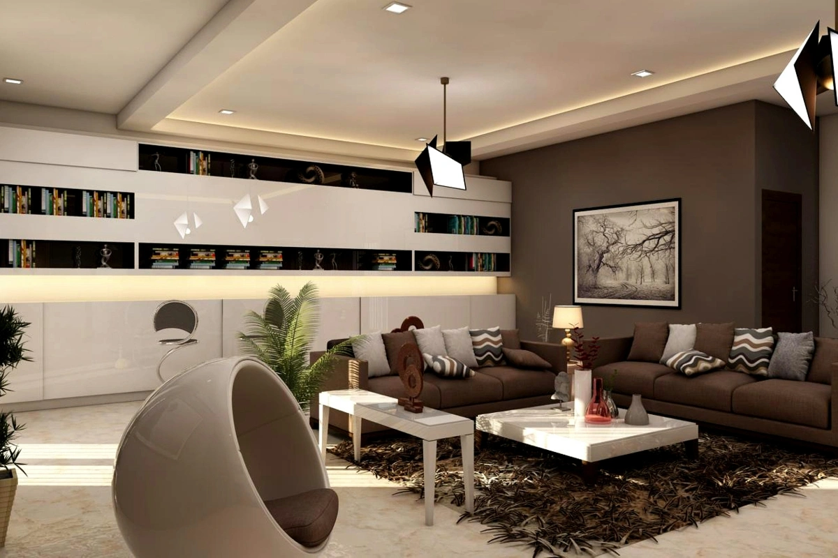
Brown color psychology in interior design cozy living room
Brown Color Psychology in Interior Design: How Brown Creates Warmth and Comfort

Brown represents stability, warmth, and comfort. It is often associated with nature and the earth.

Benefits of brown:

  • Calming
  • anti-stress & relaxing
  • enhancing your focus and concentration

Best for:

  • Living rooms
  • Rustic interiors
  • Cozy spaces

However, too much brown can feel heavy, so it’s best balanced with lighter tones.

Warm Colors vs Cool Colors

Warm Colors (Red, Orange, Yellow)

  • Increase energy and excitement
  • Stimulate conversation
  • Make spaces feel cozy

Ideal for:

  • Dining rooms
  • Social areas

Cool Colors (Blue, Green, Purple)

  • Promote calm and relaxation
  • Create a peaceful environment

Ideal for:

  • Bedrooms
  • Offices

Real-Life Example

Doing spaces myself have definitely showed me to NOT just pick paint colors by looking at a swatch. That soft, airy, and cozy beige that may look in your house could actually look more cool and moodier under your own light conditions.

In my own apartment, that warm beige that feels cozy in my living room by day, in a home under cooler light by night looks like an completely different shade. Actually painting sample on my wall and seeing it under various light, and how furniture colors played around it… it really shows up under your own light.

That knowledge is why I will tell you to truly spend a day and night showing paint samples on your wall and seeing them at every type of light possible before you make a final commitment.

Color Psychology in Interior Design for Different Spaces
color psychology in interior design, interior design for different spaces, room color psychology,
Color Psychology in Interior Design for Different Spaces: A Complete Guide

Living Room

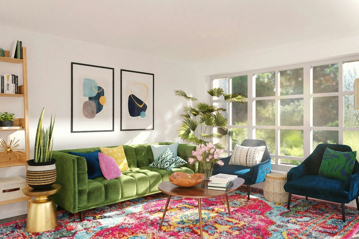
The living room is where people gather, so balance is key.

Best choices:

  • Neutral tones (beige, gray)
  • Warm accents (orange, soft red)

These combinations create a welcoming and comfortable space.

Bedroom

Bedrooms should promote rest.

Best colors:

  • Soft blue
  • Light green
  • Lavender

Avoid overly bright or stimulating colors here.

Kitchen

Colors in the kitchen can even affect appetite.

Best colors:

  • Yellow (happy and energetic)
  • White (clean and fresh)

Who is Interior Color Psychology Best for?

Homeowners who are thinking about updating a room space Designers who need help picking out a color palette and don’t know where to start Interior designers who are working on specifying a color palette for a specific function in a particular room People who have difficulties choosing between different shades of a paint color Renters who wants to boost the atmosphere of their living space without doing significant renovations People who want to create a cozy atmosphere or feeling in a bedroom or living room Designing a workspace in their home or a rental

Who Is Interior Color Psychology Best For?

Interior color psychology can be especially useful for:

  • Homeowners planning a room makeover
  • Renters who want to improve their space without major renovations
  • Interior design beginners
  • People creating a home office
  • Anyone who wants a particular mood in a bedroom or living room
  • Designers choosing a color palette for a specific room function

It is also helpful if you often struggle to decide between several paint colors because it gives you a way to think about how you want the room to feel, not just how you want it to look.

Who Should Avoid Relying Too Heavily on Color Psychology?

Color psychology should not be treated as a universal rule.

If you strongly dislike a particular color, there is little reason to use it simply because a design guide says it creates a certain mood.

You should also avoid relying on color psychology alone when choosing colors for:

  • Highly personalized spaces
  • Shared rooms with different preferences
  • Rooms with unusual lighting
  • Spaces where existing furniture strongly affects the palette

Your personal preference, lighting, room size, furniture, and architectural features should all be considered together.

Pros and Cons of Using Color Psychology

Pros

  • Helps create a specific mood
  • Makes color selection more intentional
  • Can improve visual harmony
  • Helps match colors with room functions
  • Makes decorating decisions easier
  • Can strengthen the personality of a space

Cons

  • Color responses vary from person to person
  • Lighting can significantly change how colors appear
  • Cultural associations with colors can differ
  • Too much emphasis on psychology can limit creativity
  • A theoretically suitable color may still look wrong in a particular room

The best approach is to use color psychology as a design guide rather than an absolute rule.

Practical Tips for Using Color Psychology in Interior Design

Here are some easy ways to apply interior design color psychology:

Start with Purpose

Ask yourself:
Do you want the room to feel calm, energetic, or cozy?

Use the 60-30-10 Rule

  • 60% dominant color
  • 30% secondary color
  • 10% accent color

This keeps your design balanced.

Consider Lighting

Natural and artificial light can change how colors look.

Combine Colors Wisely

Avoid using too many bold colors together. Balance them with neutrals.

Test Before Finalizing

Always try paint samples before committing.

Buying Considerations When Choosing Interior Colors

If you’re buying paint, furniture, curtains, rugs, or other décor based on a specific color palette, consider these factors before purchasing:

Check the Lighting

Look at the color under both natural and artificial lighting.

Compare Undertones

Two beige paints may look completely different because one has a yellow undertone while another has a gray or pink undertone.

Consider Existing Furniture

Your new wall color should work with your sofa, flooring, curtains, cabinets, and artwork.

Buy Samples First

Instead of purchasing a large quantity immediately, test a small paint sample or fabric swatch first.

Think About Long-Term Use

Trend colors can look exciting today but may become less appealing later. For large or expensive items, a timeless base color with replaceable colorful accents can be a safer choice.

Real-World Use Example

Think of a compact study that feels quite drab and uninviting.

You don’t need to throw in any dark or extremely vivid color for every wall; use a pale cream or a light blue on the dominant walls, add some light-colored wood furnishing, a touch of greenery and then a splash of yellow in a painting or accessories for an overall impression of brightness and lightiness, not overwhelming the space.

This case gives a little insight on how the color theory is functioning when color is seen as part of a larger interplay: the lighting, furniture, texture and functionality of the room itself.

Alternative to Traditional Color Psychology

If traditional color rules do not appeal to you, consider choosing your interior palette based on personal emotional association.

Start by selecting:

  1. One color you naturally enjoy.
  2. One neutral color for balance.
  3. One accent shade that complements the first color.
  4. Natural materials or textures that support the mood.

For example, if you associate nature with comfort, you might choose sage green, warm beige, light wood, and cream instead of following a strict color psychology chart.

This approach creates a more personal interior while still maintaining visual harmony.

External Resource

If you want to explore more about how colors influence behavior, check this helpful guide from Verywell Mind:
https://www.verywellmind.com/color-psychology-2795824

It explains how colors affect emotions in everyday life.

Final Takeaway

It’s not about finding that one “right” color either, it’s about knowing what you want the mood of the room to be and picking colors to do that for you.

Consider the function of the room, how much light is there, what the furniture is like, your personal taste and what kind of mood you want to establish and then do some test colors before going the whole hog.

A great looking room isn’t just looking good in a photo, it has to feel right in your everyday life.

Conclusion

A great way to have a room look amazing and work for it’s inhabitants is to utilize color psychology for interior design. Colors like blues can bring serenity, browns can bring earthiness and warmth, colors like green bring nature and freshness, while vibrant, warmer tones can make a room that should be livelier, like a social setting, have that life. Every room, and every individual, is different, so ultimately, there is no “correct” color.

Ultimately interior design in its truest sense is taking the world of color psychology and utilizing your own sense of taste, combined with lighting conditions, size of the room, your furniture, and what you actually do with your space day-to-day.

Regardless of the room, the bedroom, the living room, the kitchen or even the home office, interior color choice should play a big role in shaping the ambiance of your home and what you feel in each space.

 Asked Questions:

What is color psychology in interior design?

Color psychology in interior design studies how colors affect human emotions and behavior within a space.

Which color is best for relaxation?

Blue and green are the best colors for relaxation, as they create a calming effect.

How does color affect mood?

Colors can influence emotions—bright colors energize, while soft tones calm the mind.

What colors are best for office interiors?

Blue, green, and yellow are ideal for offices as they improve focus, reduce stress, and boost creativity.

Can color make a room look bigger?

Yes, light colors like white and soft pastels can make a room appear larger and more open.

Author Bio

Md. Sohel Parvez is a Home decor Content creator and Pinterest marketing expert of Silkraj.com, offering useful home decor inspirations, interior styling guides and creative decorating tips to assist people in making their homes attractive, cozy and functional.

Md. Sohel Parvez shares practical home decor guidance, advice on trendy interior style and decorating strategies designed to help homeowners, renters, home decor lovers to embrace an effortless interior design. The guides contain practical suggestions for warm bed rooms and lively living rooms, walls decoration, seasonal style and awesome interior updates. His guides are loaded with expert décor ideas as he presents every step with practical directions.

With all his useful home decorating tips and realistic ideas presented through practical examples, the author strives for simplicity for the ordinary reader, so that anybody can easily enhance the value of his or her home with excellent décor.