
Introduction
Color has always played a powerful role in shaping how a space feels, but recently, a dramatic design approach has taken over homes, apartments, and even offices. This technique, known as color drenching interior design, is quickly becoming one of the most talked‑about decorating styles. Instead of using multiple contrasting colors, color drenching focuses on saturating a room in one dominant shade across walls, ceilings, trim, furniture, and even décor.
This design trend is gaining popularity because it creates a cohesive, bold, and visually immersive experience. Moreover, it simplifies decorating decisions while making spaces look professionally designed. Whether you prefer deep, dramatic tones or soft,t neutral palettes, color drenching can work in almost any room.
In this detailed guide, you will learn what color drenching is, how to use it, bedroom ideas, neutral color options, comparison with traditional design, real-life examples, case studies, and expert-level tips. Additionally, you will discover how this trend can transform small rooms, modern homes, and minimalist spaces.
Original inspiration source:
Color Drenching Interior Design
What is Color in Interior Design?
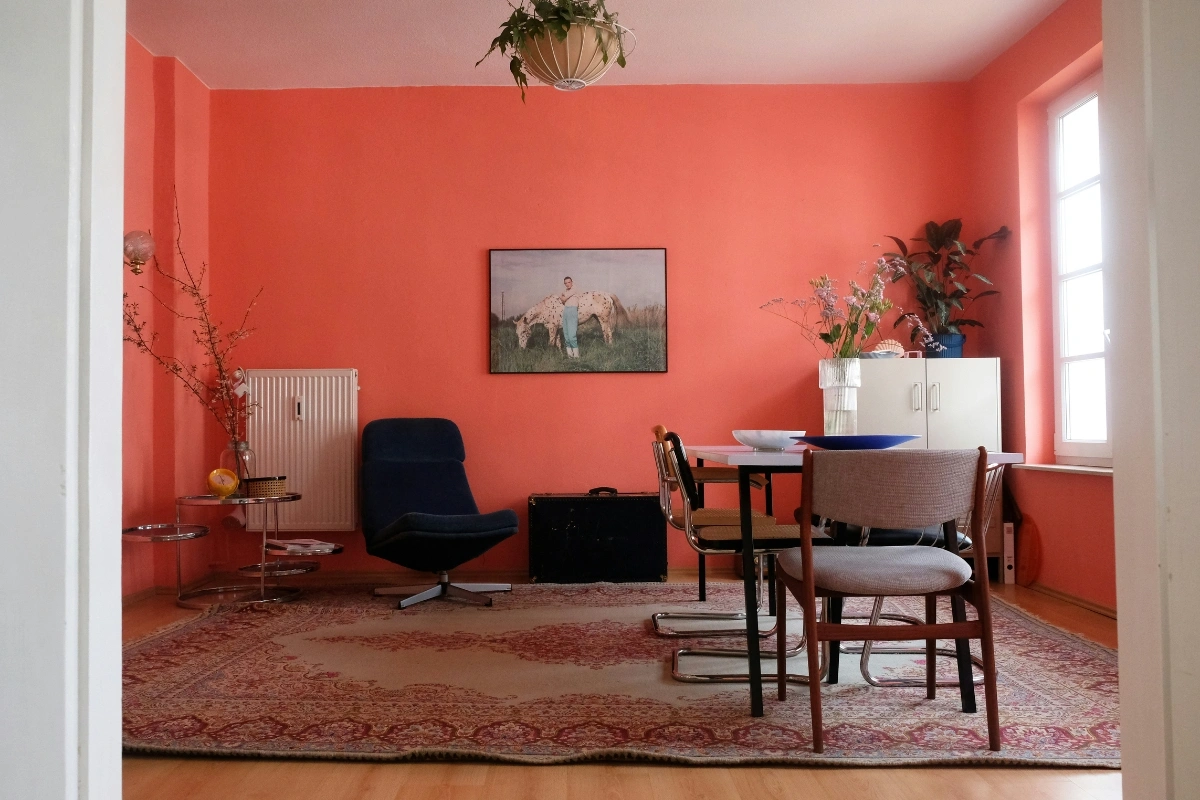
Color in interior design refers to the deliberate use of shades, tones, and hues to create atmosphere, balance, and emotional impact. Designers carefully choose colors to influence mood, perception of space, and overall aesthetics.
For example:
- Warm colors create cozy environments
- Cool colors promote calm and relaxation
- Dark tones add drama and sophistication
- Light tones make spaces appear larger
However, color drenching takes this concept further. Instead of combining multiple colors, it uses one dominant color across nearly every surface. As a result, the room feels unified and intentionally designed.
What is Color Drenching Interior Design?
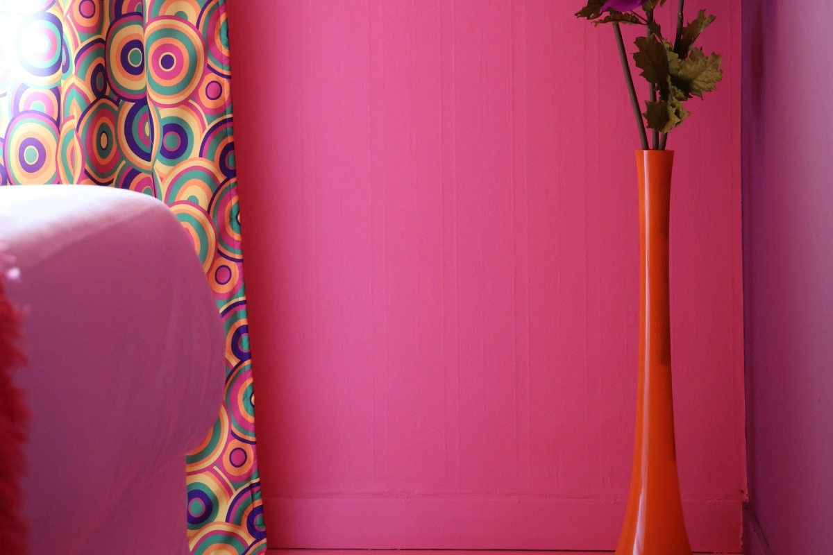
Color-drenching interior design is a decorating technique where a single color is used throughout an entire space, including:
- Walls
- Ceiling
- Trim
- Doors
- Furniture
- Shelving
- Décor accents
Sometimes, even fabrics and lighting are selected in the same color family. This approach creates depth, mood, and a cohesive visual flow.
Unlike accent walls or color blocking, color drenching removes contrast. Therefore, the space feels immersive and luxurious.
Why the Color Drenching Interior Design Trend is So Popular
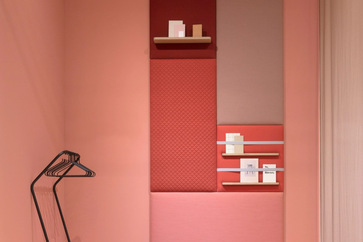
The color-drenching interior design trend is growing rapidly because it offers multiple benefits. First, it simplifies decision-making. Second, it creates a dramatic impact. Third, it works in both small and large spaces.
Here are the main reasons this trend is everywhere:
- Creates a cohesive look
- Makes rooms appear larger
- Adds designer-level sophistication
- Works with both bold and neutral palettes
- Perfect for modern and classic homes
- Great for bedrooms and living rooms
Additionally, social media platforms and design blogs have amplified this trend. As more homeowners experiment with bold colors, color drenching continues to grow in popularity.
Decorative Color Drenching Interior Design Ideas
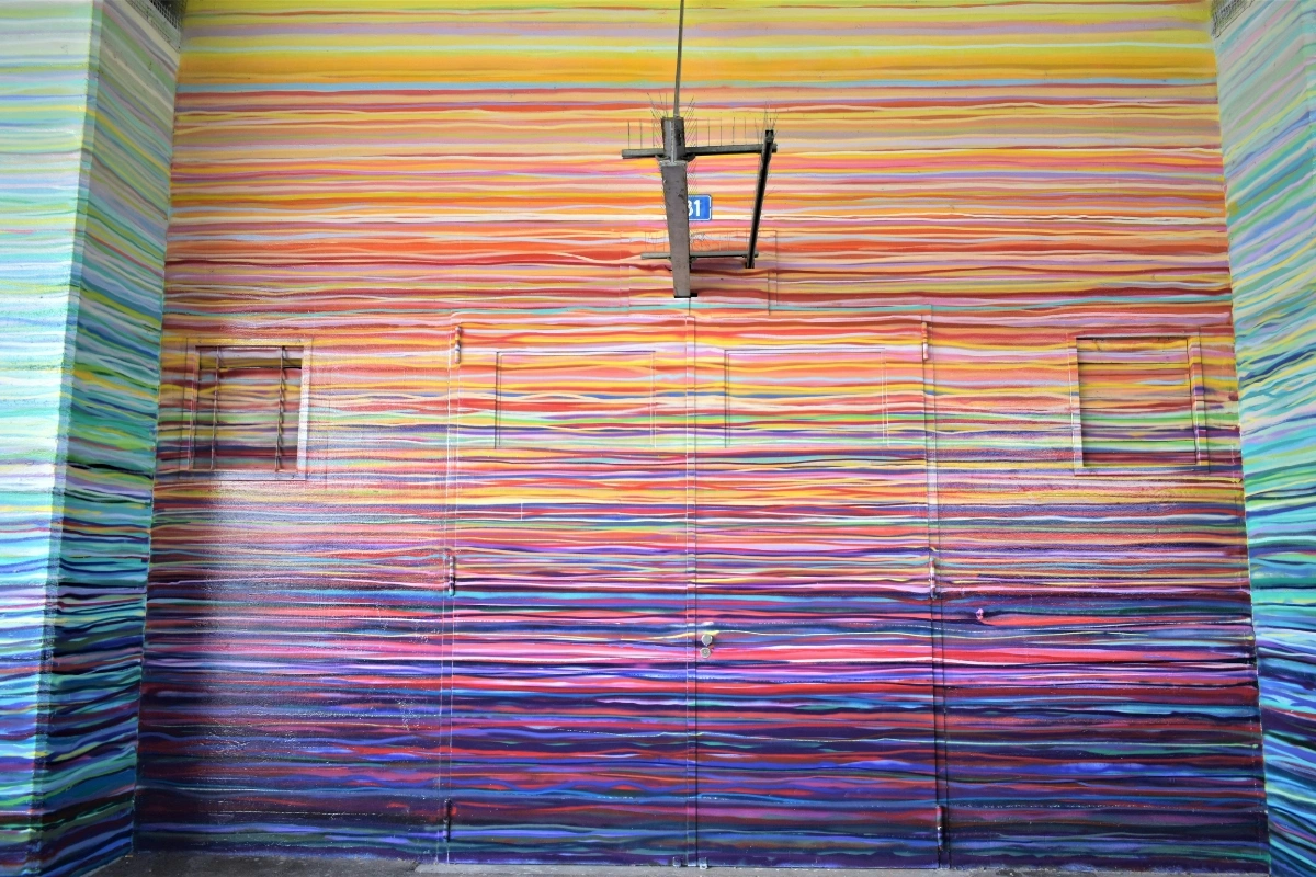
If you want to try decorative color-drenching interior design, there are several creative approaches. You do not always need bright colors. Instead, you can use muted tones, earthy shades, or even neutrals.
Popular decorative color-drenching ideas include:
Deep Green Color Drenching
Deep green walls, matching trim, and velvet furniture create a calm yet luxurious environment. This works especially well in reading rooms and bedrooms.
Warm Beige Neutral Drenching
Using beige across walls, ceiling, and fabrics creates a soft and minimal aesthetic. This is perfect for modern interiors.
Navy Blue Dramatic Drenching
Dark navy drenching adds depth and elegance. Moreover, it pairs beautifully with brass or gold accents.
Terracotta Earth Tone Drenching
Terracotta tones make rooms feel warm and inviting. This works particularly well in living rooms.
Color Drenching Bedroom Interior Design Ideas
Bedrooms are one of the best places to use color drenching. Since bedrooms benefit from calm and cohesion, a single color palette creates a relaxing atmosphere.
Top color-drenching bedroom ideas:
- Soft sage green bedroom drenching
- Dusty pink monochrome bedroom
- Charcoal gray modern bedroom
- Cream neutral color drenched bedroom
- Sky blue calming bedroom
Additionally, using matching bedding, curtains, and rugs enhances the effect. Consequently, the room feels professionally styled.
What Are Neutral Colors in Interior Design?
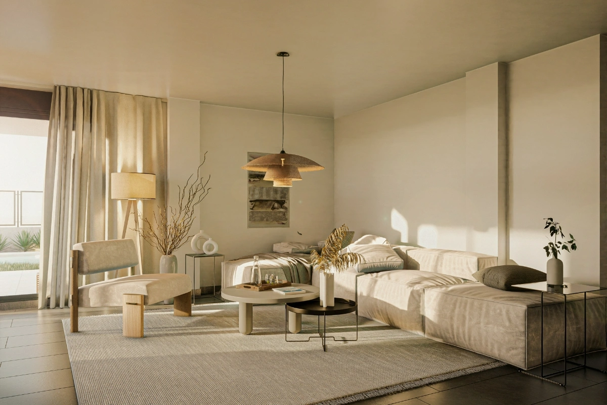
Neutral colors in interior design include shades that are subtle, calming, and versatile. These colors do not dominate visually, yet they create a sophisticated backdrop.
Common neutral colors include:
- White
- Beige
- Cream
- Taupe
- Soft gray
- Greige
- Warm sand
Neutral color drenching is especially popular because it keeps spaces bright while maintaining cohesion. Furthermore, it allows furniture textures to stand out.
Color Drenching Interiors vs Traditional Interior Design
| Feature | Color Drenching Interiors | Traditional Interior Design |
| Color usage | One dominant color | Multiple contrasting colors |
| Visual effect | Immersive and cohesive | Layered and segmented |
| Space perception | Makes the room feel larger | Can divide space visually |
| Difficulty level | Easy to coordinate | Requires balancing colors |
| Trend factor | Modern and trendy | Classic and timeless |
| Mood | Bold or calming | Balanced and varied |
This comparison shows why many homeowners now prefer color-drenching interiors. It offers simplicity while delivering a strong visual impact.
Real-Life Example of Color Drenching
A small apartment living room was recently redesigned using color drenching. Previously, the room had white walls, dark furniture, and mismatched décor. As a result, the space felt disconnected.
After applying soft olive green across the walls, ceiling, shelves, and curtains, the transformation was dramatic. The room appeared larger, calmer, and more cohesive. Additionally, matching cushions and artwork strengthened the look.
Visitors immediately noticed the difference. The space felt intentional rather than randomly decorated. This real-life example demonstrates how color drenching can completely transform even small rooms.
Personal Experience Using Color Drenching
When experimenting with color drenching in a home office, a muted blue tone was applied across the walls, shelving, and trim. Initially, there was concern that the room might feel too dark. However, after completing the design, the space felt surprisingly calm and focused.
Because everything shared the same color family, visual clutter disappeared. Moreover, productivity improved since the environment felt more organized. Even simple décor items blended seamlessly.
This personal experience highlights how color drenching not only improves aesthetics but also enhances functionality.
Case Study-Small Bedroom Color Drenching Transformation
A compact bedroom measuring approximately 10×10 feet was redesigned using color drenching. The goal was to make the room feel larger without a major renovation.
Steps used in the case study:
- Selected warm taupe color
- Painted walls and ceiling the same shade
- Used matching bedding
- Added tone-on-tone curtains
- Chose similar color furniture
Results:
- The room appeared larger
- Lighting felt softer
- Space looked professionally designed
- Visual clutter reduced
- More relaxing atmosphere
This case study proves that color-drenching bedroom interior design works especially well in small spaces.
Author Bio
Md. Sohel Parvez
Founder of silkraj.com
With a strong interest in home decor and interior design, I share practical ideas and insights to help people create beautiful and functional living spaces. My goal is to make interior design simple and accessible for everyone around the world. Through practical tips and real-life inspiration, I aim to guide you in transforming your home with confidence.
How to Use Color Drenching Successfully
To achieve the best results, follow these expert tips:
Choose the Right Color First
Start with a color that matches the room’s purpose. For example, bedrooms benefit from calm tones, while living rooms can handle bold shades.
Use Different Finishes
Even with one color, you can vary finishes. Use matte walls, satin trim, and textured fabrics.
Include Texture
Texture prevents the room from looking flat. Consider rugs, cushions, and curtains.
Add Subtle Contrast
Use slightly darker or lighter tones within the same color family.
Consider Lighting
Lighting affects how the color appears. Test samples before committing.
Common Mistakes to Avoid
Although color drenching is simple, some mistakes can reduce its effectiveness.
- Using too many accent colors
- Choosing overly bright tones for small rooms
- Ignoring lighting conditions
- Not matching furniture colors
- Forgetting ceiling color
Avoiding these mistakes ensures a polished result.
Best Rooms for Color Drenching
Color drenching works especially well in:
- Bedrooms
- Living rooms
- Home offices
- Dining rooms
- Reading nooks
- Hallways
Additionally, small spaces benefit the most because color drenching removes visual breaks.
External Resources for Color Drenching Inspiration
For more inspiration, you can explore these trusted design resources:
- Architectural design galleries
- Interior styling trend reports
- Home decor inspiration platforms
- Professional paint brand color libraries
These sources help you choose the right palette and see real-world applications.
Key Elements of Color Drenching Interior Design
Single Color Palette – Unified visual appearance
Matching Walls and Ceiling – Immersive effect
Layered Textures – Adds depth
Soft Lighting – Enhances tone variation
Minimal Contrast – Clean modern aesthetic
Outbound Resources
Color-drenching inspiration:
https://www.archdaily.com
Interior color trends:
https://www.thespruce.com
Modern color palette ideas:
https://www.housebeautiful.com
FAQ
Q. What is Color Drenching Interior Design?
It is using one color across walls, ceiling, and trim for a cohesive look.
Q. Is color drenching good for small rooms?
Yes — it can make spaces appear larger and more unified.
Q. What colors work best for color drenching?
Warm neutrals, soft greens, blues, and earthy tones.
Q. Does color drenching make rooms too dark?
Not if balanced with proper lighting and textures.
Conclusion
Color Drenching Interior Design is a bold yet elegant trend shaping modern homes in 2026. Furthermore, using a single cohesive color creates depth, harmony, and visual impact. Ultimately, this design approach transforms ordinary interiors into immersive and stylish living spaces.
Read More: